Buttonpresser Studios
ExploreAbout
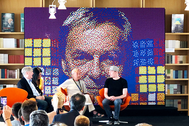
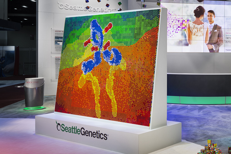
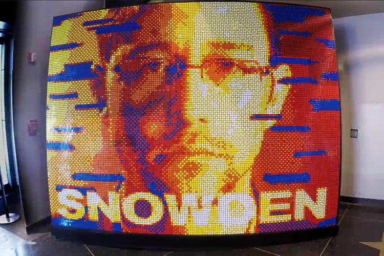
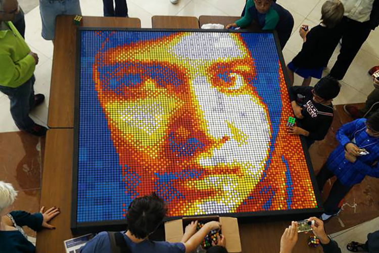
Buttonpresser Studios was started in 2012 by artist and designer Pete Fecteau. Buttonpresser Studios specializes in creating custom mosaics using non-traditional media for corporate clients, collectors, galleries and museums.
Buttonpresser Studios continues to produce works for commission and special events.
Read Pete's BioPortfolio
Method & Maddness
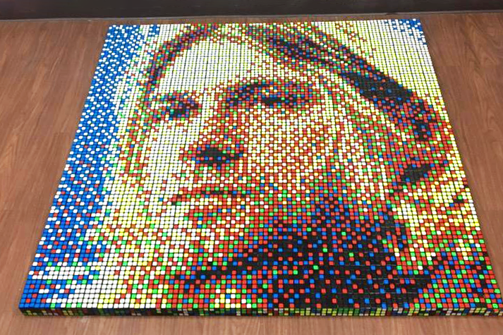
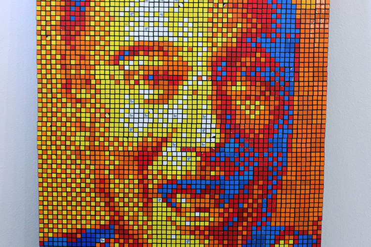
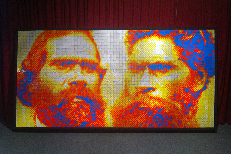
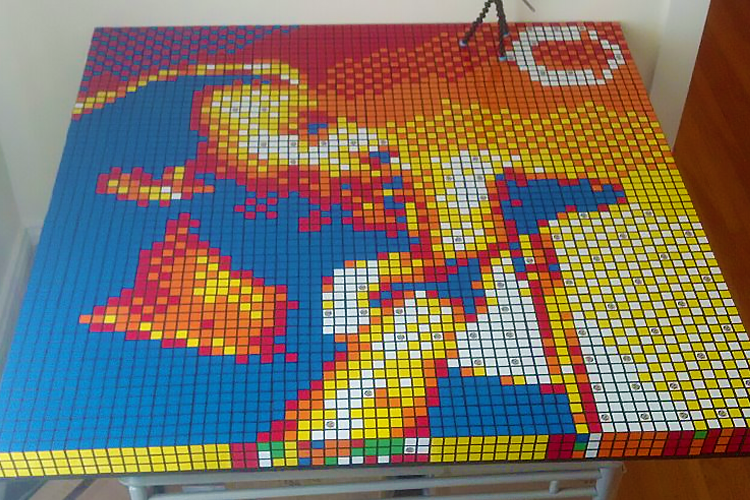
The awe-inspiring aesthetic of a "cube-ist" mosaic isn't just the fact that it's made from hundreds, sometimes thousands of cubes. The scale and the vibrant colors trigger powerful emotions; like those you had as a child opening a present on your birthday.
Pete's mosaics also utilize a little known optical illusion, the human brain's embedded facial recognition software. The effect is so effective it even fools the lesser intelligent versions found in modern cameras.
The cube lends itself beautifully to an artistic process, that is, if you're willing to take the time. Mosaics are created painstakingly and meticulously by hand, one cube at a time. Few people are so dedicated to their craft.
-
Process
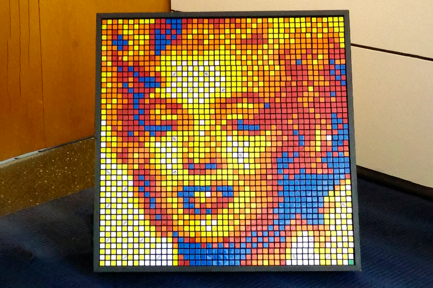
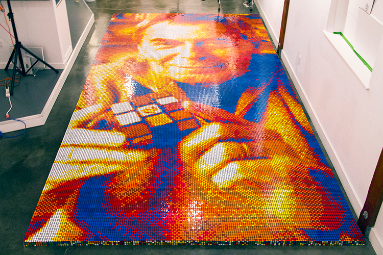
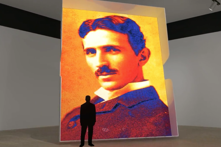
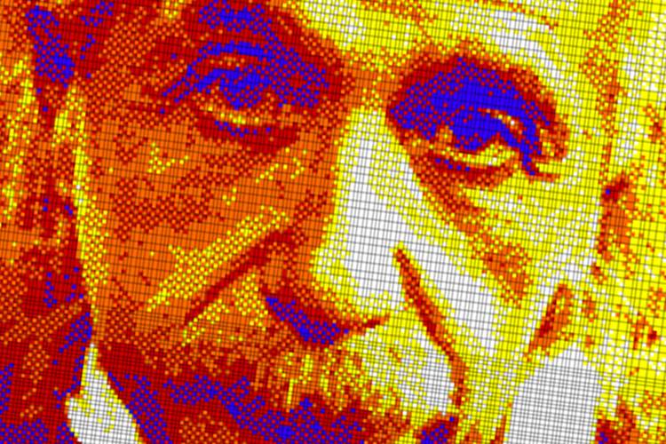
The process for building a mosaic starts on the computer. Pete uses Adobe Photoshop to process images into black and white and then translates the shades of grey into the cube's iconic colors.
Each of the 'cubies' act like pixels on a sceen, the more pixels in a mosaic means the more resolution in the final image. A mosaic can take upwards of 100 hours to be ready for the production process.
-
Logistics
As you can imagine, purchasing thousands of cubes isn't exactly easy. Also take into account the shipping, customs, receiving, and a dozen other steps it takes to get Rubik's Cubes ready for use in a mosaic and you'll know why these mosaics are so unique.
Buttonpresser Studios has years of experience in setting up all the little details that bring a mosaic from concept to completion.
-
Production
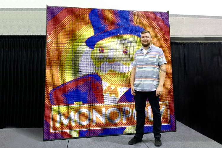
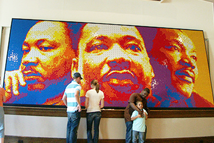
When it comes to production, it takes a certain breed. While solving a cube might seem like an impossible task, partially unsolving thousands of cubes, hours at a time, is the real trick.
Keeping track of progress and making sure every 'cubie' is correct requires a constant vigil. Bringing a mosaic to life is a feat of mental and physical fortitude.